
The NEI & COVID-19
How can you use NEI data in relation to the COVID-19 crisis, and it’s recovery? The Neighbourhood Equity Index highlights places that are more vulnerable than others: it points to key problems that are the weak spots in implementing safety measures, and areas of particular concern for recovery post-COVID, such as areas with:
-
- No essential services like a grocery store or pharmacy within walking distance
- A higher percentage of people in inadequate housing (unaffordable, overcrowded or unsuitable)
- Higher percentage of vulnerable people (seniors living along, people with mental health challenges)
- A higher proportion of part-time workers or residents who are working poor
- More calls for first responders (for mental health crises or crime)
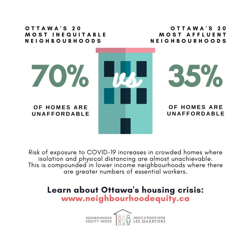
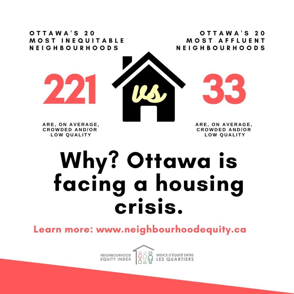
Physical distancing and social isolation can be challenging for people in neighbourhoods with a higher percentage of inadequate housing. Residents of neighbourhoods where most households are unsuitable, crowded, or unaffordable are at greater risk of contracting the virus. The importance of social isolation is higher for seniors in both private and congregate houses. This dashboard presents the number of inequitable households, and households at higher risk of exposure to the virus in Ottawa NEI neighbourhoods.
How to Use the Dashboard
- Select a Neighbourhood from the interactive list of neighbourhoods located on the left pane. The map will zoom to this neighbourhood and the dashboard indicators around the map will update with the statistics for the selected neighbourhood.
- Bring different indicators into view by clicking on the tabs under the indicator and map windows.
The map displays:
- The four colours depict the outcome of the NEI Renting Affordability indicator. Red signifies areas with the highest percentage of renters who pay >30% of their income on rent.
- The outlined areas with coloured contours reflect the areas with a higher presence of housing where residents have more difficulty maintaining social distancing or can be at increased risk of exposure to the virus.
- The proportional symbols represent the number of Seniors living in Collective Housing. The colour of the circle outline is related to the prevalent type of senior homes within a Neighbourhood.
- Senior Residence – grey
- Nursing home & Residence – blue
- Nursing home – red
The size of the symbol represents the total number of seniors in collective housing.
The Layers Menu ![]() can be open from the top right corner of the Map. It allows changing the map display to view the distribution of different household types:
can be open from the top right corner of the Map. It allows changing the map display to view the distribution of different household types:
- Not Suitable households
- Households with at least one Senior aged 65 and over
- Multigenerational households
- Two or more persons non-family households
- Renting households
- Living in buildings 5 stories or higher
Click within a Neighbourhood or open the Legend: ![]() to reveal more information.
to reveal more information.
Data Notes
Collective Senior Homes include:
- Senior Nursing Homes
- Senior Residences
- Mixed Nursing and Residence Homes
Housing Suitability: Refers to whether a dwelling has enough bedrooms for the size and composition of the household (taking into consideration age, sex and relationship among household members) based on the National Occupancy Standard
Data Source:
- Neighbourhood Equity Index
- Statistics Canada, Custom 2016 Census Tables, accessed via Ottawa and Region Data Consortium
Prepared by the Social Planning Council of Ottawa
Dashboard: Vulnerable Seniors Populations
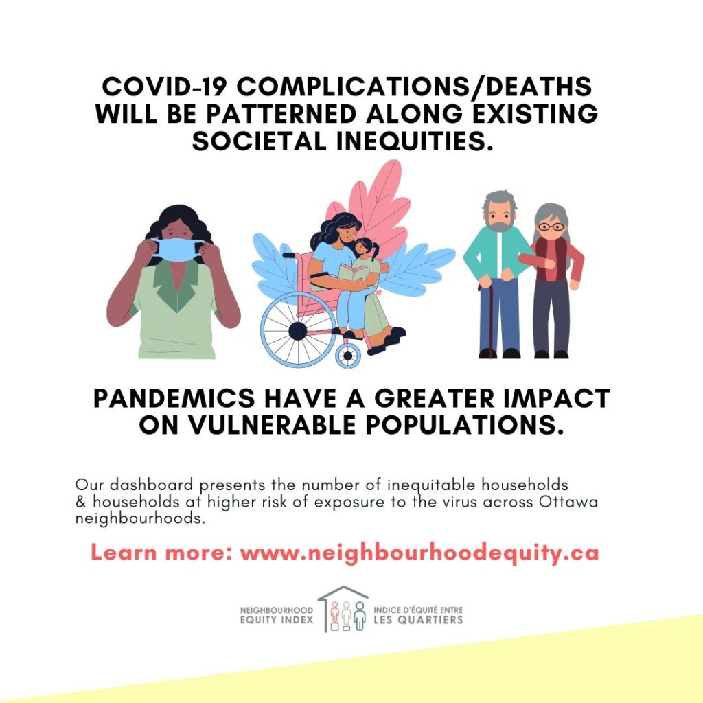
The COVID-19 pandemic is exposing the vulnerability of elderly populations. Among seniors, those in low income, living alone, or with disabilities are more exposed to the health and economic impacts of the pandemic. To many multicultural seniors the language barrier is an added factor limiting access to essential services and basic needs.
This dashboard presents the number of vulnerable seniors in Ottawa NEI neighbourhoods, as well as locations of food banks, and the neighbourhoods where seniors of similar birth region are present in relatively high numbers.
How to Use the Dashboard
- Select a Neighbourhood from the interactive list of neighbourhoods located on the left pane. The map will zoom to this neighbourhood and the dashboard indicators around the map will update with the statistics for the selected neighbourhood.
- Bring different indicators to view by clicking on the tabs under the indicator and map windows.
The map displays:
- Areas of Strong Equity Concern in Population Health are outlined with Red.
- Food Bank locations are indicated with a red pin symbol.

- Senior’s isolation – both physical and linguistic – is indicated by the colour and the size of the proportional circles. The size of the circles corresponds to the number of seniors living alone. The colour of the circles relates to the number of seniors with no knowledge of an official language. Darker colour indicates a larger number of linguistically isolated seniors.
- Areas with relatively high number of seniors from selected regions of birth are shown on the map using different colours. Seniors with same origin would likely have similar diet preferences.
-
- Africa
- East and Southeast Asia
- Southern Asia
- Europe
- West Central Asia & Middle East
- South America or the Caribbean
The Layers Menu ![]() can be open from the top right corner of the Map. It allows changing the map display to view the distribution of different indicators.
can be open from the top right corner of the Map. It allows changing the map display to view the distribution of different indicators.
Click within a Neighbourhood or open the Legend: ![]() to reveal more information.
to reveal more information.
Data Notes
Seniors – refers to the population age 65 and over in private households.
Living alone – Seniors in one person private households.
Linguistic isolation – Seniors with no knowledge of either official language.
Low income – according to the Low Income Measure After Tax (LIM-AT).
Place of birth – indicating diet preferences, according to ethnic origin. Excludes North America. Grouped into key geographic regions and with respect to the number of Ottawa seniors born in a particular region.
Disability – Seniors reporting activity limitation of any type and with any frequency. Based on disability screening questions data, 2016 census.
Data Source:
Statistics Canada, Custom 2016 Census Tables, accessed via the Ottawa and Region Data Consortium
Prepared by the Social Planning Council of Ottawa
Maps: Interactive maps on issues related to COVID-19
Data Sets
Available for download and re-use (currently available as .xlsx files). Click to download.