Ottawa Neighbourhood Equity
History and Partners
History
Ottawa is rich with data that tells a myriad of stories that provide a snapshot of the everyday lives of the city’s residents. The sources of the data can vary in scope from the granular (Ottawa Neighbourhood Study) to the municipal (Ottawa Insights) with each data source designed to improve local service delivery, inform public policy, and/or illuminate city-wide inequities1. Yet, despite the richness in available data, the city is missing a holistic, systematic and defensible data tool to identify inequities and prioritize neighbourhoods that are struggling with the essentials of life. Conceivably such a tool would also help identify priorities for investment and show a trend over time on overall neighbourhood health equity.
To address this gap United Way Ottawa, the City of Ottawa, and the Social Planning Council of Ottawa have adapted the WHO Urban HEART (Health Equity Assessment and Response Tool) approach and developed the Neighbourhood Equity Index (NEI). The NEI methodology closely follows the City of Toronto’s Urban HEART methodology with changes where necessary to reflect the uniqueness of the Ottawa context. The Urban HEART approach to measuring and visualizing inequity has been piloted in 10 countries around the world and is widely recognized as a credible tool for informing health equity interventions and system level changes.
The Neighbourhood Equity Index (NEI) works in tandem with various data approaches to understanding and addressing inequity at the neighbourhood level in Ottawa. All of the data approaches have historical roots to place-based community development initiatives, in particular the South East Ottawa 2004 place-based community development approach; the Community Health Resource Centres (CHRC) Community Development Framework (CDF); the United Way Ottawa 2010 Strong Neighbourhood’s Priority Goal; and the Ottawa Neighbourhood Social Capital Forum. The NEI builds on past work and serves as a single tool that stakeholders can access to make evidence-based decisions and plan collaboratively for a more equitable, stronger, and healthier Ottawa. The NEI also aims to be a tool that educates, empowers, and mobilizes service providers, policy makers and community members on equity related issues in their communities and across the city as a whole.
Following a widespread consultation process with multiple community health centres, non-profits and City stakeholders, the NEI was designed to include 5 domains (economic opportunity, social and human development, physical environment, population health, community and belonging) and 28 indicators. Each of the selected indicators was determined to be salient for Ottawa, feasible and empirically valid, locally actionable, responsive, specific enough for a small geographic area with flexibility of scaling up to the level of the City, variable with a range of data, and replicable over time. In response to the consultations, the NEI will be at a standard geography, the census tract level, in order to enable comparability and overlap with other data sources and methods and to minimize costs of updating.
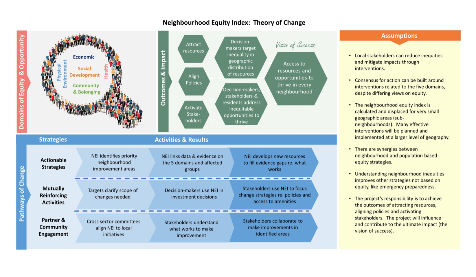
To facilitate and mobilize change, the NEI Theory of Change is broadly structured around the Index’s production of actionable evidence which by design is meant to activate stakeholders and community partners, and increase geographically based access to equitable resources and opportunities to thrive in every neighbourhood in Ottawa.
Partners
The Neighbourhood Equity Index (NEI) is a product of the expertise and commitment of a number of stakeholders at the United Way East Ontario (formerly United Way Ottawa), City of Ottawa, and several Ottawa based data driven non-profit organizations. The Social Planning Council of Ottawa NEI team is indebted to the Steering Committee and the many Working Groups that guided and provided invaluable information necessary for the development of the Index in Ottawa. The creation of the Index was made possible due to the generous funding provided by the United Way East Ontario and the City of Ottawa.
The NEI would not have been possible without the guidance and support of the following working group members: Diane Urquhart (Social Planning Council of Ottawa); Alex Mayer (Centretown Community Health Centre); Kristine Hart (Ottawa Community Foundation); Nathalie Sirois (Conseil des écoles publiques de l’Est de l’Ontario); Allison Lampi (Local Health Integration Network); Anthong Le (Ottawa Carleton District School Board); Darrell Bridge (City of Ottawa); Elizabeth Kristjansson (University of Ottawa); Joan Oracheski (Ottawa Carleton District School Board); Justin Swan (City of Ottawa); Laura Masson (City of Ottawa); Randy Mar (Ottawa Police Service); Rebecca Aird (Ottawa Community Foundation); Paul Steeves (United Way Ottawa); and Robert Grimwood (City of Ottawa).
Special thanks to the expertise and support of Cinthia Pagé (City of Ottawa); Julie Pearson (United Way); Ben Dick (City of Ottawa); Cameron McDermid (Ottawa Public Health); Clara Friere (City of Ottawa); Kathleen Moss (Ottawa Carleton District School Board); Tamatha Trenholm (City of Ottawa); Vinh Nguyen (City of Ottawa); Brian Schnarch (Local Health Integration Network); Katie Carr (Ottawa Neighbourhood Study); Eva Walrond (City of Ottawa); and Abid Jan (United Way Ottawa).
Lastly, the NEI is a product of the hard work and dedication of the NEI team at the Social Planning Council of Ottawa, in particular Stefka Patchova (lead researcher), Katelynn Martin (GIS Mapper), Vladimir Mikadze (researcher), Nicholas Barrett (GIS researcher), and Sadia Jama (researcher).